Ademola Adeagbo
Open for work Resume

Case study

Studyline

A study companion for every subject, from secondary school to university.
Role
UI/UX designer (solo)
Timeline
November 2026
Platform
iOS · 390 × 844
Scope
Research plan, UX, UI, prototype, dev handoff
Type
Concept project
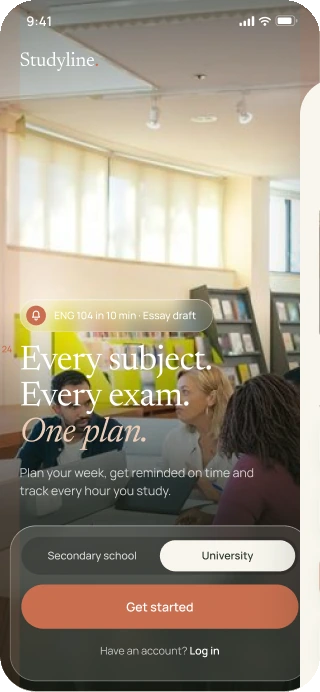
Studyline Get started screen for university students
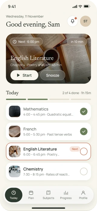
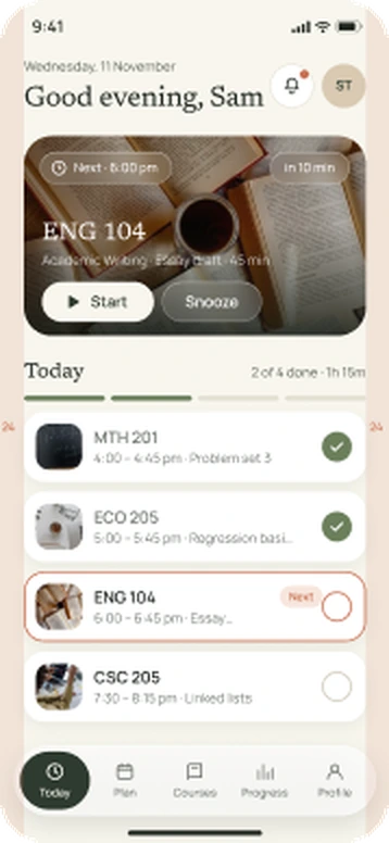
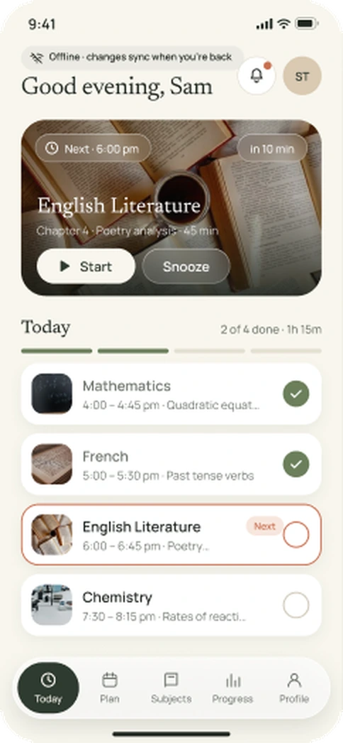
Studyline Today screen showing 2 of 4 sessions done

01 · Overview

One plan for every subject and every exam

Studyline is a study companion for secondary school and university students. It turns subjects, exam dates and free hours into a weekly plan, reminds students before each session, runs a focus timer and shows progress. I designed it end to end: structure, flows, UI, a design system, a full prototype with every state, and developer handoff.

02 · Problem

What I set out to fix

Students juggle many subjects, a timetable and exam dates, usually in their heads or on paper. General to-do apps don’t know about subjects, free hours or exams, so a plan falls apart the first time a session is missed. Most study apps also focus on one level, either school or university.

This is a concept project. The points above are my starting assumptions, to be checked in the usability tests below.

03 · Goals

Goals

01

Plan

Build a realistic week from the hours a student actually has.

02

Recover

Make a missed session easy to move, not a reason to give up.

03

Focus

Give every session a clear start, break and end.

04

Both levels

Work for secondary school and university without two separate apps.

04 · Audience

Two students, one app

A secondary school classroom

Secondary school

  • Subjects like Maths, Literature, French
  • Class level (Junior / Senior)
  • Mock and final exams
  • Evening study after school
A university library

University

  • Courses with codes (ECO 201)
  • Year and course of study
  • Tests, essays and lectures
  • Free time around a timetable

05 · Structure

Information architecture

Today

  • Next session
  • Sessions
  • Notifications

Plan

  • Week and days
  • Month
  • Add / edit session

Subjects

  • Subject detail
  • Topics
  • Add subject

Progress

  • Week
  • Month
  • Streak

Profile

  • Reminders
  • Study hours
  • Exam dates
  • Account

06 · Flows

12 prototype flows, every one linked

  1. 1New student (secondary)
  2. 2New student (university)
  3. 3Returning student and log in errors
  4. 4Daily study
  5. 5Reminder: start, snooze, skip
  6. 6Plan and calendar
  7. 7Home screen widget
  8. 8University day
  9. 9Offline
  10. 10Reminder (university)
  11. 11Widget (university)
  12. 12Offline (university)

07 · Decisions

Design decisions

Real photos, not illustrations

Photos of real classrooms and desks make the app feel like it belongs to students, not to a template.

Glass only where it earns it

Frosted glass sits only over photos and floating controls, never behind long text, so it stays readable.

One accent

Terracotta is used for the one main action on a screen. Everything else stays forest, sage and cream.

Missed is not failure

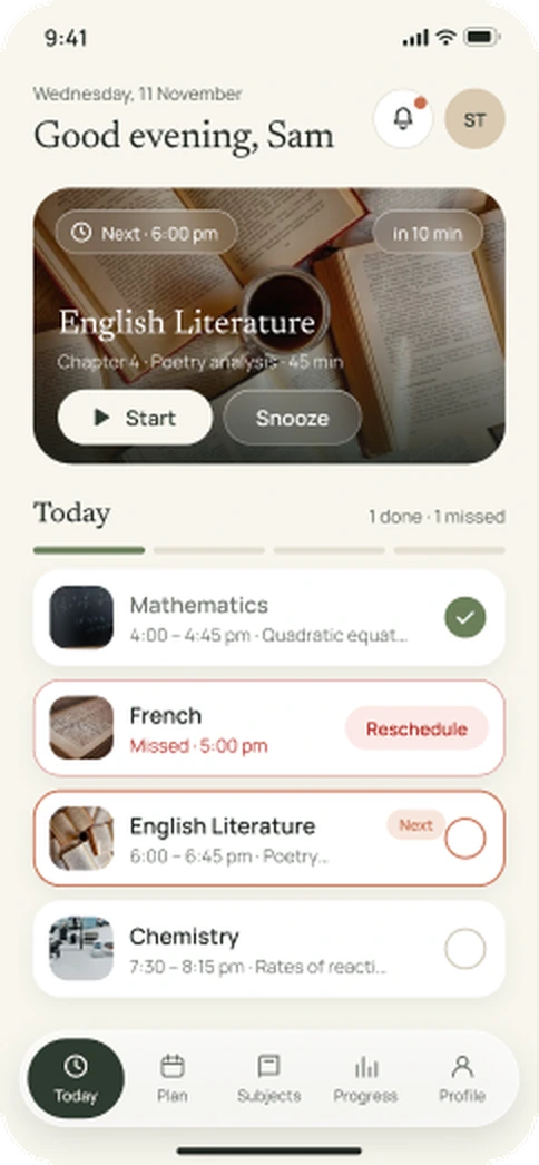
A missed session gets a Reschedule button instead of a red mark that stays.

Single vs multi choice

Subjects and study days are multi-select. Class, year, reminders and colour are single-select, and the prototype behaves that way.

Every state designed

Errors, empty, loading, offline, locked and expired states are all screens, not afterthoughts.

08 · Design system

Earthy palette, two typefaces

  • Forest #2E3A2F
  • Sage #6B7F5B
  • Sand #D9C9B2
  • Terracotta #C96F4F
  • Cream #F8F6EE

Newsreader

Headings and numbers

Manrope

Everything you read and tap

09 · Key screens

Key screens

10 of the full set of 340 screens, chosen to show the weekly plan, a focus session, progress and both student tracks.
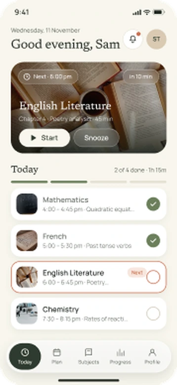
Studyline Today screen showing today's sessions and 2 of 4 done
Today
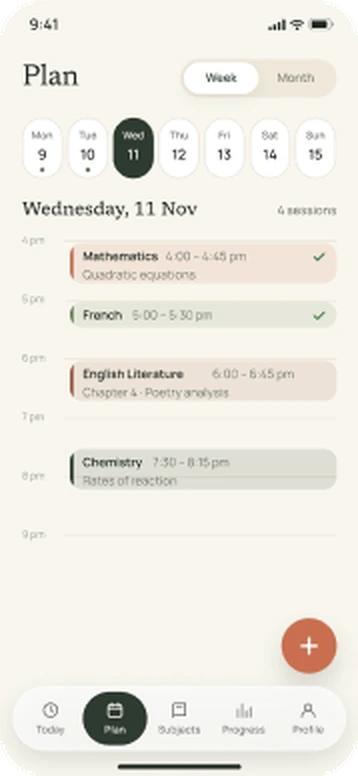
Studyline weekly Plan screen for Wednesday 11 November
Plan
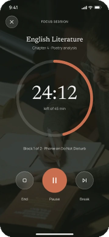
Studyline Focus screen with a running study timer
Focus
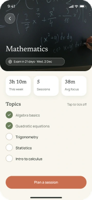
Studyline Subject detail screen for Mathematics
Subject
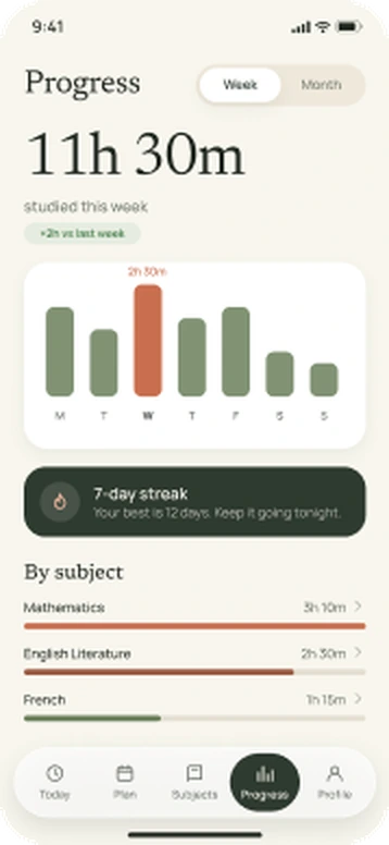
Studyline Progress screen showing the week's study hours
Progress
Studyline Today screen for a university student with course codes
University

10 · States

Every state, not just the happy path

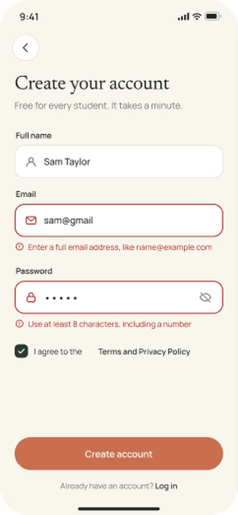
Studyline sign-up screen showing validation errors
Validation errors
Studyline Today screen showing a missed session with a reschedule action
Missed session
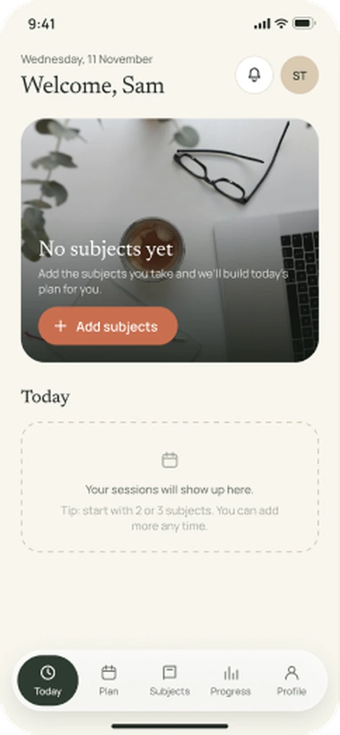
Studyline Today screen with no subjects added yet
Empty
Studyline Today screen in its offline state
Offline

340 screens across both tracks · 0 dead taps in the prototype

11 · Handoff

Ready for developers

The Dev Handoff page covers 21 screens with 75 numbered spec cards: element, attributes, data, states, validation, every error message and edge cases. Components use Property=Value variants for Dev Mode, and colours and text are saved as styles.

  • 21 screens specified
  • 75 spec cards
  • Every error message in one table
  • Interactive components with real states
Studyline sign-up screen with validation errors, used in the developer handoff
Sign up · Validation errors

12 · Testing

Usability test plan

  • 5 secondary-school and 5 university students, 30 minutes each, think-aloud
  • Tasks: sign up and set up, log in after errors, start / pause / end a session, snooze a reminder, add then undo a session, reschedule a missed one
  • Measures: task success, time on task, errors, ease rating (1–7)

Status: planned. Results will be added here after the sessions. No numbers are shown before real tests.

13 · Next

What I learned and what’s next

  • Every state (errors, empty, offline, locked) was designed alongside the main flow, not added at the end.
  • Two tracks (school and university) share one structure; only content and labels change.
  • Next: run the tests, then add Android and a dark theme.